I am crazy in love with this newest picture of mine...
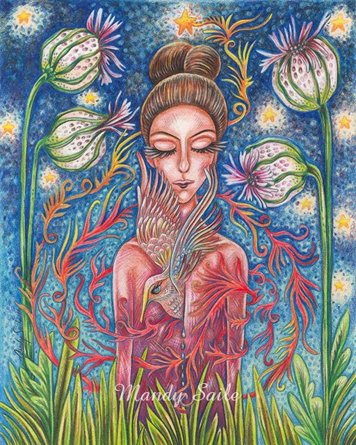
"Tilda & Thorton"
(these are photos so please excuse any slight blurriness)
The complementary kinship of a fine lady & her feathered friend.
This is an acrylic painting with coloured pencil on muslin, which I sewed up in tapestry style, so a black wooden pole will slip through on the top and bottom & it will hang by a beaded string.
ohhh soooo loving it. It's been awhile since I've done a picture, stood back and whispered to myself
'wow, you did that...'
Well this was one of those pictures & it's awesome when that happens cause it doesn't happen alot.
Prints of Tilda & Thornton will be available in my online shops soon.
Prints of Tilda & Thornton will be available in my online shops soon.
XO Mandy


10 comments:
Okay Mandy, this is awesome!!
Simply gorgeous! Love those colors, bet it's even more incredible in person. Love it :)
Bijou, you have every right to be in love with that image...it is great. Not to mention the great job you did sewing it up (once you ditched the fancy-pants new sewing machine, and when for the old metal one).
Well done....can't wait to see the other imgaes.
Oh these are simply gorgeous.
I was thinking the other day about what it is, specifically, about your art that I love so much and I thought of three things: it is whimsical; the colors are vibrant; but most especially: they have movement.
PS I've got most of the posts set up in draft mode and yours looks great! I'm just waiting to hear back from three other guest bloggers and then I'll send out an email with dates!
Hah! Love it. Although I do find myself hoping that her hat extends far enough to keep the bird from pooing on her face.
Simply stunning! And I agree with the previous comment (by ladaisi) about the movement in your photos. It's what makes them so engaging.
Thank you so much Diane, Donna, Jonathan, Lauren, Lisa and Jill, your comments today on Tilda and Thorton really made my day, I am so happy with the piece I was really hoping others would love it too.
I take it as such a huge huge compliment when you say my pieces have movement, thank you so so much. That's wonderful, espeacially when it's a fairly static composition. I don't know, I've always always loved center compositions the most and so that's what I use in my own images. Some people think it makes an image boring but in my opinion it kinda speaks more towards the design/concept having strength and courage and a proudness to stand front and center...but that's just me. Even though I design most things with a center composition, I think it's the way I apply my colour that gives it an energy of movement, and I am so glad you guys are feeling that, because I believe everything is energy, so when I am working on a piece and picturing, almost conversing with the animals and ladies in my image, I imagine their energy sort of emminating outwards...anyhow, ha ha...abit wordy but I LOVE that you guys are totally feeling what I am trying to do, yayyy:D
Thanks to you all....today I have a really bad migraine, but I popped into blogger anyways to make sure my post went up okay and low and behold there were all your lovely comments waiting for me...what a much needed treat.
P.S. Lauren I can't wait for the post, I will definatly spread the word on my end and feel honored that you want to feature me, thanks so much again.
XXOO.
Wow! Amazing, i love it
The lady reminds me of my friend Nora, who wears several hats at once, all on top of each other! and lots of purple.
Mandy this is beautiful!!
LOVE.IT!!
Post a Comment